1. How did you use media technologies in construction and research in the evaluation stages?
2. In what ways does your product use, develop or challenge forms of conventions of real media products?
After watching the music video 'Mercy' by Duffy, we decided that the dress codes used in the video are ones that we felt would be suitable for our own video. We also felt that the subtle use of makeup that Duffy wore, made her look a lot more sophistcated and we felt that by using this style on our own artist would mean that both the look we were going for would be achieved as well as meaning that the audience would not be distracted from what is happening around them, which may happen if a vast amount of makeup was worn. It also added to the vintage look that we wanted to portray. We also decided that the look meant that the artist looked like a mature character and felt that this would be most suitable for our video. We wanted to emphasise the retro look in our video, so copied the idea of the dress and subtle makeup in which Duffy wore in her video 'Mercy'. We also felt that the dress that the artist wore in our video was one that represented the lyrics well, because of the star motif. We also liked the muted and simple colour scheme used in 'Mercy', so therefore went for a similar look.
After researching the different techniques that were used in lots of different videos, we noticed that a high emphasis is normally shown by using close-ups on objects or faical expressions on key lyrics or parts of the song. We felt that this was shown by the use of close-ups on the guitar in 'Black Horse And The Cherry Tree' by KT Tunstall. We incorporated this technique throughout our video, by using a close-up shot on the guitar when the artist tapped it in time with the beat in the song. This meant that the tapping of the guiatr could really be emphasised. This was effective, because it amplified the music and we found that Andrew Goodwin's theory said that close-ups should always be included.
We decided that after watching 'Black Horse And The Cherry Tree' by KT Tunstall, that the concept of two personalties in a video was an idea that could really be emphasised, especially when showing the narrative of our video. In the video 'Black Horse And The Cherry Tree', there were two different characters, whereas in our video the artist was both characters, however the change of hairstyle and clothing meant that they could easily be identified as being different. We felt that we needed to include a different look to the artist in order to incorporate the narrative of her life on and off of stage.
The star motif is one that we wanted to use after hearing the song for our video for the first time. We felt that the stars reflected the glamour of our artist as well as lightening the mood of the video in the parts that were not in back and white. It was also due to the amount of times that stars were mentioned throughout the video and we thought that this could be emphasised by using many different techniques when filming and preparing our video. The song 'Starry Eyed' by Ellie Goulding was a video that we researched when planning how we could portray the star motif and we felt that we could develop the concept of her video further. We did this by not just using 'Green Screening', but by the clothing worn by the artist and the fake tattoo on her arm. We felt that certain lyrics in the video, mentioning stars would be ones that we could amplify by using a starry background.
After watching this video by Katy Perry, it was clear that she did not use Green Screening in the video, but instead used natural looking settings. We found that this was also the case for many other videos withing the indie genre. We challenged this concept by using Green Screening' in our video, firstly because we felt that it would give us a backgroud that emphasised and brought out the lyrics in certain parts of the song and secondly because we felt that it would add another dimension to our video.
After watching the video 'Say You Don't Want It' by One night only and many other videos within the same genre, it was clear that a narrative was present. Most of the time, they would include a scene that it completely in contrast to the rest of the video, so we took this idea and then challenged it. We did this by changing our narrative to be in black and white. We felt that this would show clearly the change in the mood of our artist. Also when watching other narratives in videos, the colour on screen is rarely dull and normally show a happy mood. We challenged this again to emphasise the sadness and depression of the artist at being stood up.
3. What have you learned from your audience feedback?
After reading the feedback that we received from our audience, it was clear that many of them felt that we should have had more people involved in the video in order to make i more interesting. people also commented on the fact that the lighting could have been more interesting during the close-up shots. On the other hand, it was also complimented on about the Green Screening being 'very professional looking'. People also liked the black and white parts of the video as they said it showed a clear change in storyline. I felt that the feedback gained from the audience was very helpful and i think that if we were to make the video again in the future, then a lot of the ideas given to us when asking for feedback could be included.
4. How effective is the combination of your main product and ancillary texts?
When putting together our final digipack and advert, we wanted to make sure that the emphasis that we portrayed was mainly on the change of mood throughout the video, as well as the matching of the star image with the lyrics and the song itself. We did this through the colours and images that we used in the design. We achieved this by desaturating the pictures to give a melancholy mood and using natural lighting to brighten the mood. We used images of stars on each of the pages to again emphasise the motif of a star image and a glamourous artist.
The image we constructed for our artist was directly inspired by that of Duffy in the video for Mercy. We took the ideas from her vintage inspired dress, long, blonde styled hair and high heeled black shoes. By using this as the image for our artist, it has helped to create a look that directly links to female artists of the indie and acoustic genres, making it obvious to the audience where our artist fits in terms of music style. This retro, 1960’s era, inspired look also reflects the individuality of the artist and her music, which appeals to the audience. The styles of this era are popular with modern musicians as it was a time when music in Britain was at its prime and popular culture was taking off, with bands such as The Beatles, and influences from the fashion industry including models like Twiggy. You can compare these models, and stresses, specifically those such as Brigitte Bardot, with the style of Duffy, and similarities in their appearance and styling become obvious.
Duffy
Brigitte Bardot
Dyer’s star theory suggests that an artist’s image is constructed for the purpose of audience appeal, in this case, Duffy’s image in created to appeal to the older generation who would remember when that sort of styling was popular first time round, as well as a younger generation who take interest in their parent’s background and inspiration from vintage fashions and music. By creating our artist’s image in this way, we have made her appeal to a wider audience, as her image is put into a context that would make her seem more individual and creative.
We took inspiration and copied some of the shots from the video for Black Horse And The Cherry Tree by KT Tunstall. These featured close up views of the artist playing a guitar. Our artist listed one of her major influences as being KT Tunstall, so it was an obvious choice for us to look to this artist for ideas when producing our video. We felt these shots worked particularly well as they show the skill of the artist as a musician, which would be appreciated by the members of her audience who are interested in the technical side of the music.
In this video, the artist is seen to be almost forming a band by herself. She takes on different images throughout the video as she plays different instruments. We developed this convention of a changing image by drastically changing the image of our artist for our performance-based part of the video and the narrative story line. We felt by developing this convention in this way allowed us to link our narrative and performance to the lyrics of the song, such as when she states that she ‘can’t handle your excuses’ anymore, it sounds as if she is letting go of someone, and as she does this, her image changes to reflect her change of mind. This connects with the KT Tunstall video as the changing image is used to suggest a change in the artist’s personality and state of mind. The physical change in the image from our performance to the narrative was the haircut, from long, blonde hair to short, and a more brownish colour. The connotations of the long blonde hair are almost stereotypical of a feminine, girly style. This is contrasted to the more edgy and fashion forward connotations of the short, 'pixie' style haircut. It is becoming a more and more popular choice of hairstyle nowadays, with celebrities pushing the boundaries, such as Victoria Beckham, and Frankie Sandford from girl band The Saturdays and acting as style role models to young girls.
Victoria Beckham
Frankie Sandford
This shorter hairstyle is often associated with strong minded, independent women who are taking a stand against the stereotypical views of what women should look like and are proving that they can still be successful and desirable with an unconventional image.
We had already thought of using a Star motif throughout our video when we came across this video by Ellie Goulding. Superimposing as well as props were used to portray a star motif. We developed this convention of using a motif further, in the choices we made for costume- using a star print dress, green screening- with stars in the background and make up- by painting a fake tattoo onto the arm of the artist. This star motif was effective in our video because like in the Ellie Goulding video, it linked the performance on screen to the lyrics of the song such as ‘the stars are just scars that you burnt and you hurt’. By picking out the stars in the lyrics, we were enabled to use them in the styling and editing stages of our video to link the song to the video which helped put the video into context, and would make more sense to the audience about why the video was made for that particular song. The connotations of the stars link to feminine, glamourous, sparkly themes, which we felt were good traits to be picked up on in our artist's image.
Our green screening idea came from wanting to develop our star motif, even though we hadn’t viewed it in any videos by artists in this genre. In this Katy Perry video which we studied previously, all of the locations are actual settings. By challenging this convention, we were able to develop our star motif further, and introduce a new type of editing into videos of this genre. We feel that the green screening we used in our video was effective as it gave another obvious link to the lyrics of the song. This is an unusual technique to use in a video of the indie genre, as emphasis is normally put on narrative storylines and performance based scenes in natural looking settings. However, we felt that with our star motif, we could challenge this convention and it helped to create an exciting and creative video.
A convention we observed in videos from similar artists to ours was the use of muted colour schemes. In this video by One Night Only, we see the use of limited colour palettes throughout. We decided to challenge this convention further, by putting our entire narrative storyline into black and white. We felt that the use of limited colour schemes worked well in our performance based part of the video, but the clothing and setting choices we made for our narrative seemed to clash quite a lot. By putting all of this footage into black and white we were also enabled to distinguish the different parts of the video easily, which helped to reflect the drastic change in the image of the artist. The colour connotations of black and white normally represent being drained of colour or emotion, this links with the lyrics and storyline of our video, in which the artist is seen waiting for someone, and getting stood up. She appears to be fed up, and therefore the draining of colour could represent the lack of feeling she now has for this person, and her anger at them.
What have you learned from your audience feedback?
How effective is the combination of your main product and ancillary texts?
The main things to take away from this are that the effectiveness of the combination of our products was due to the consistency of images and icons between all three texts.
After reading the feedback we received, the audience stated that the guitar fitted the indie genre. They also told us that the dresscode 'suited the style of music, and picked out the stars'. We wanted to bring out the star motiff and we were pleased that the audience noticed at reacted to this. The green screanning we used was described as 'Professional looking', once again we did this to empahsize the star motiff. We were told the lip syncing was good and that it fitted the lyrics.
The Audience told us that the lighting could have been a bit more 'interesting' during the close up shots, it was alos described as being 'dull'. We were also told that there could have been more people in the video as the use of one person got a bit 'boring' and 'reptitive.
How effective is the combination of your main product and Ancillary texts
The dress code was a key part in linking the products because it gave the inspired vintage look, this linked to the Duffy dress code we researched whose image is constructed to appear retro, sophisticated and 60's inspired.
The main factor in which why the ancillary texts are an effective combination is because all the images link together and they are sets from which we see in the music video.
How did you use media technologies in construction and research in the evaluation stages?
In what ways does your product use,develop or challenge forms of conventions of real media products?
Duffy- Mercy
Here is an example of a convention we have used. Here we used a similar dress code to Duffy. We used the same dress code because it was subtle and it gave the retro look we were trying to portray, we felt that the subtle use of make-up made Duffy look sophisticated. By using this look which included long blonde hair and heeled shoes it enabled us to link directly to a female artist. We saw this similar dress code in some of the research we had done for the indie genre. 'Closest thing to crazy'. We went for the same colour scheme which you see in Duffy, which we felt was muted and simple. we did this because it would keep the audiences attention on the artist. We noticed this when researching the indie genre. 'Sweet about me'
Kt Tunstall- Black Horse Cherry Tree
Here is another convention we used. We used the clapping on the guitar which we see in the Kt Tunstall video, we also zoomed in on the guitar when the clapping occurred. We did this to draw focus to the clapping. We saw this effect in our research that during key parts of lyrics in songs will be emphasised out to the audience by camera shots. Kt Tunstall
Kt Tunstall- Black Horse Cherry Tree
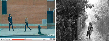
Here is a convention we developed , in the Kt Turnstall video you see two difference personalities but in our video we used the same person but we changed the image by having a different hair style. There was a different hair style for the narrative, to show that there is a different image for the off stage and on stage image. Even though we used the same person you could clearly identify that they were different.
Ellie Goulding- Starry Eyed
Here is another convention we developed, in the Ellie Goulding video there is a subtle star motiff but in our video had stars on the green screening but we also had them on the dress and a tattoo on the arm. We really wanted to emphasize this motiff because it was mentioned in the lyrics a number of times.
One night only- Say you dont want it
A convention we challenged is that for the narrative 'Say you dont want it' is in color but for our music video we put this in black and white. We did this so you can see the difference between the narrative and the performance. By making this black and white it would clearly show the difference in the artist we wanted to show to the audience.
Katie Perry
Another convention we challenged is that we used green screening in our music video but in the Katie Perry video there in not any green screening used but that was a natural setting. We used the green screening because we had a star motiff so we wanted to emphasize this is much as possible. We felt it would add another location to the video which would make it more interesting to the audience.
These are the final 6 pages for the inside booklet for our Digipack. I edited phtotos we took whilst filming our video using Adobe Photoshop, adding lyrics from the songs featured on the album and a message from the artist, and took screenshots from our video to include also. I am really happy with these final images, and I think that together, they really make a professional looking effective Digipack booklet. I continued the star motif from our video throughout the Digipack, along with the muted colour schemes, and vintage style through the use of font.