Pages

Monday 29 November 2010

Final Digipack Images


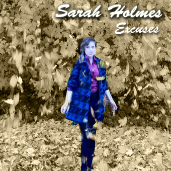
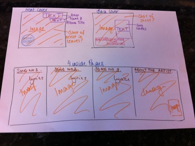
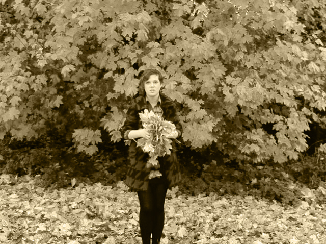
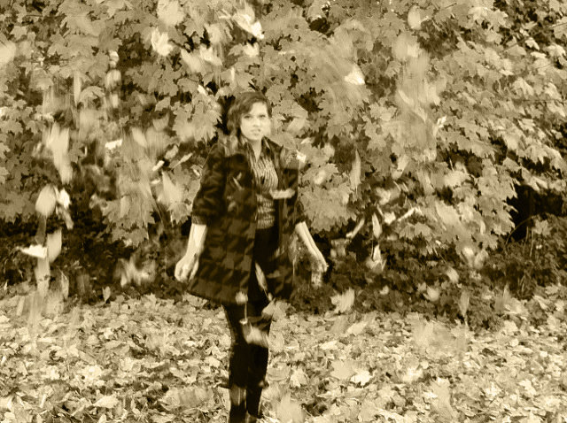
These are the final 6 pages for the inside booklet for our Digipack. I edited phtotos we took whilst filming our video using Adobe Photoshop, adding lyrics from the songs featured on the album and a message from the artist, and took screenshots from our video to include also. I am really happy with these final images, and I think that together, they really make a professional looking effective Digipack booklet. I continued the star motif from our video throughout the Digipack, along with the muted colour schemes, and vintage style through the use of font. 

FRONT PAGE:


DOUBLE PAGE INSERT: 


CD PAGE:


MESSAGE PAGE:


BACK PAGE:


Sunday 28 November 2010

The video is now on YouTube


The video is now on YouTube so this should get us more audience feedback

Thursday 25 November 2010

Possible Album Covers


Tuesday 23 November 2010

Digipack Advert Ideas


This is a Digipack print advert for "The Master Plan" by Oasis. The overall effect of the advert is fairly simple, with plain fonted text and 1 image. The main focus is the name of the band and the image, suggesting the more important parts of the advert. The colour scheme reflects the image, with black and white, the flash of red emphasizes the name of the Digipack, so it would stick in the viewers mind to make them think about buying it. The small amount of advertising at the bottom informs the viewer where exactly they can buy the product, making it easy to access.

Thursday 18 November 2010

Facebook Page

Just created a facebook page so we can get more audience feedback. We just need to upload the video, here is the link for the page, start inviting all of your friends.


Facebook Page


Tuesday 16 November 2010

Album magazine adverts from Echoes

Echoes Magazine


Album magazine adverts from Songlines

Song lines


Digipack Plan


Here is a rough plan and ideas for our digipack.

"Katy Perry- One Of The Boys" Front Cover

This is the front cover of "One Of The Boys" by Katy Perry. The vintage and retro inspired image that is constructed for the artist is reflected in the use of colour. The candy/pastel shades of of the props and within  the image are also used in the text. The font here has been constructed to match this image. When adding text and colour to our Digipack, I think we could take inspiration from this, maybe not the exact style and colour due to the differences in the artists, but by using matching fonts to go with the picture well. 

Email to Sarah Holmes

"hi Sarah, 
as you know, we are now a fair way into our coursework. We have almost completed the video for "Excuses" and are now on to making an accompanying digipack design and magazine advert. For the digipack we were wondering if you have 2 more songs that we could feature on it, we would only need the song titles and lyrics (as we dont have to actually make the CD). Also, we would like to do a small feature in the back for "about the artist" so if you would like us to quote you here, we think it would be nice for you to write us a couple of sentences explaining your musical influences, or things that inspire you etc. just as a nice little thing to finish it off :) as soon as the video is done we will email you a copy as we would love to here what you think about it! 
thank you for everything once again, 
Karis, Will and Jamie xxxxx"


This is the email we have just sent to our artist, Sarah Holmes, to request some information for our digipack. From researching and looking at lots of digipacks, we think it would be good for us to include song lyrics and a message from the artist, as it gives a more personal feel that appeals to the buyer. 

Monday 15 November 2010

Digipack Ideas- Prezi


Album Cover Photos

The photos that we have uploaded to potentially use for our album cover (see previous posts) have been edited using photoshop. After looking at digipacks from artists similar to ours, we noticed and were inspired by the use of monotone and muted colour schemes. SO we changed the colours of the images we had taken whilst filming into a muted, sepia colour scheme to see the effect. I really think the images look better like this, as they appear to have a vintage look to them, and create a better overall shot than when they are in full colour. We are now working on our Digipack and Magazine advert.

Wednesday 10 November 2010

Location Images

We have uploaded these pictures of the outside locations.

Tuesday 9 November 2010

More Filming

On Friday, we decided that it would be necessary to do some more filming, to increase the different number of shots in the video, as well as creating more of a narrative for our video. This now means that we have four different locations in our film. We are now at the editing stage on Final Cut Express. This footage is a narrative storyline, we had originally thought about using a narrative, but decided against it. However, we decided that our video lacked movement and direction, so we decided on a narrative to incorporate this and link to the lyrics with in the song. We took inspiration from the lyrics such as 'I can't handle your excuses' to come up with a story in which the artist appears to be waiting for someone who she has arranged to meet, but they do not turn up, so she gives up, deciding she cannot 'handle their excuses'. We are also planning to put the narrative into black and white, as this will add a retro and vintage feel to the video, which we had taken inspiration from videos from artists similar to ours. It will also help to distinguish the difference between the 2 main bodies of footage as since we filmed our first footage, I had all of my hair cut off, so the artists image which we originally constructed for our footage is now different. However, in 'The Black Horse And The Cherry Tree' video we looked at by KT Tunstall, we noted how the artists image changed throughout the video to make her appear almost as though she is a different person, so we do not feel that this change in image will be a huge problem.

Album Cover Ideas

Photo 1- Full Colour

 Photo 1- Muted Colours

 Photo 2- Full Colour

 Photo 2- Muted Colours

 Photo 3- Full Colour

 Photo 3- Muted Colours 

Photo 4- Full Colour

Photo 4- Muted Colours 

Here are some photos we took whilst filming our video to potentially use for our digipack. 

Tuesday 2 November 2010

KT Tunstall - Eye To The Telescope


This is another front cover of a digipak from an artist similar to ours, KT Tunstall. The colour scheme is fairly muted, and limited, contrasted to the red, yellow and green stripes on her braces, which are colours often associated with the Reggae genre, indicating one of the influences in her music. The font is fairly sketchy in style, and looks unstructured, which reflects the dishevelled look to her hair, and casual dress. Although her sight line is directly to the camera, and she has open body language, the sex appeal of the artist still remains edgy and subtle, as opposed to being extremely obvious. The shadow behind her adds depth to the image, but with the contrast in light emphasizing her pale skin and the white text of her name.

Monday 1 November 2010

Duffy - Album Cover


Now that we are on our way with editing our final product, we are also beginning to look more at the digipack which we are going to make to accompany it. For this, we are looking for inspiration from artists who also inspired our video. This is the front cover of the 'Rockferry" album by Duffy.
We liked this image in particular, for several reasons. Firstly, the fact that it is in black and white emphasizes that her style follows a retro and vintage inspired look, which is emphasized by the font used, the old fashioned train station setting, and the styling of the artist.

Filming Done!!

We have now finished all of the filming for our Music video, and are now beginning to edit in Final Cut Express. The whole filming process took approximately 3 hours, as we filmed the whole song through many times, using different lighting, camera angles and locations. This has left us with reasonably large amounts of footage, which is beneficial to us as it gives us lots to choose from when editing. We are now beginning work on our first rough cut.